New Abcopro website
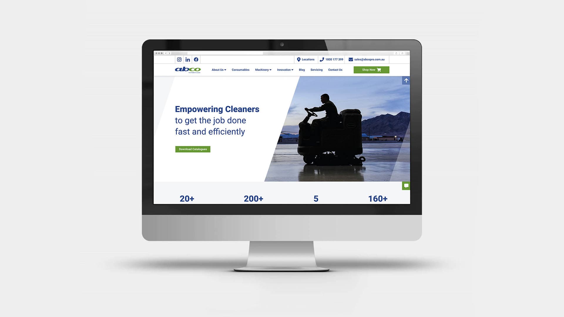
When I first applied to work at Abco, the job was posted as being for Graphic Design. Initially, the directors wanted only to 'facelift' their current website as it was not easy to read, was difficult to update and did not help sales and customer service. However, once they saw my portfolio, they expanded my role to UX design as they urgently needed a new website that was modern, easy to navigate and accessible. The company's ICT manager proposed creating a new customisable and easy-to-update CMS (Content Management System) with sanity.io.
Abco had an umbrella of websites, so I had to first look at all their content and decide what to use. The biggest challenge was that their content was spread out in too many places and channels, and information (especially about the cleaning equipment) needed a total restructure.
I created a hierarchy of information and ideated a user journey map that would be easy to navigate - not only for the external user but also for our internal sales team.
After months of fleshing out the correct information and producing lo-fi wireframes, I produced a Figma component template system and responsive prototype for our software engineer to refer to, before building our new CMS.
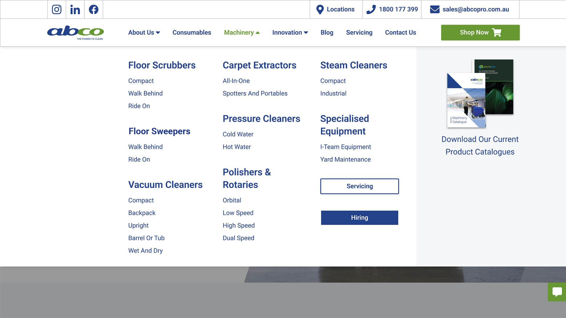
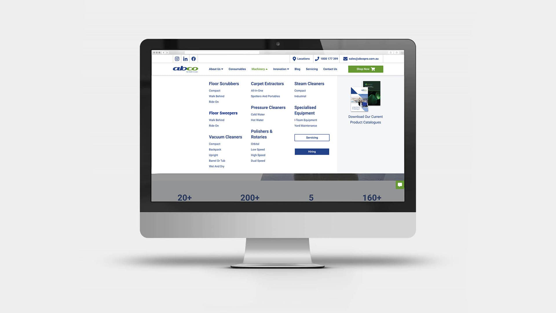
What I'm most proud of in this project is the content and the user journey experience I created for the machinery information. As I was simultaneously working on the 3rd edition of the machinery catalogue, I created the website's mega menu to reflect the same categories and sub-categories as the catalogue's table of contents. This helped our customer service team to find the relevant information easily and more consistently.
I'm also proud of having worked and collaborated with the Business Development Managers (BDM). I was able to create a correct equipment hierarchy, and sub-categorise it to help the user find the information more effectively, thus also helping the sales team create better customer relationships.
Here's an example of the machinery UX flow:
- When you hover over the machinery link from the top navigation bar, the mega menu appears with all of Abco's equipment grouped into main categories and sub-categories. You can also access all the main categories of equipment from the machinery page.
- On the machinery page all the equipment is grouped into eight main UI cards.
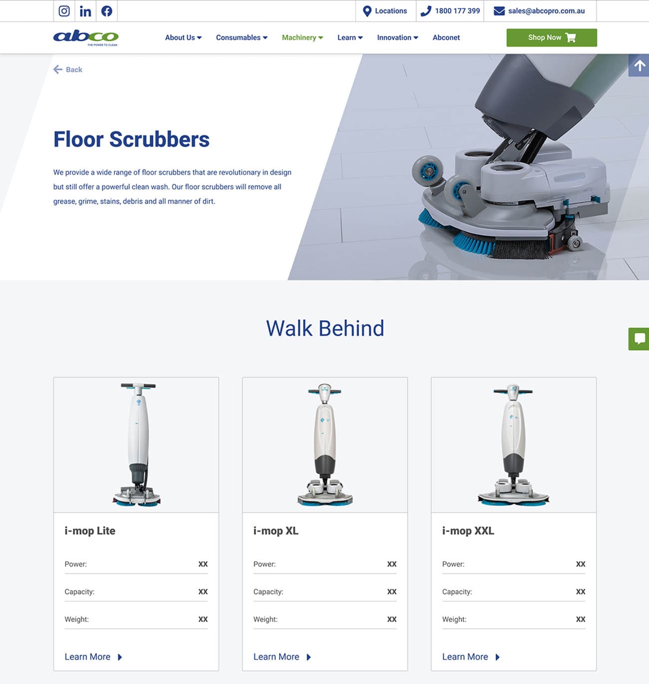
- Clicking on a main category card leads you to its main page, with all its individual products divided into sub-categories.
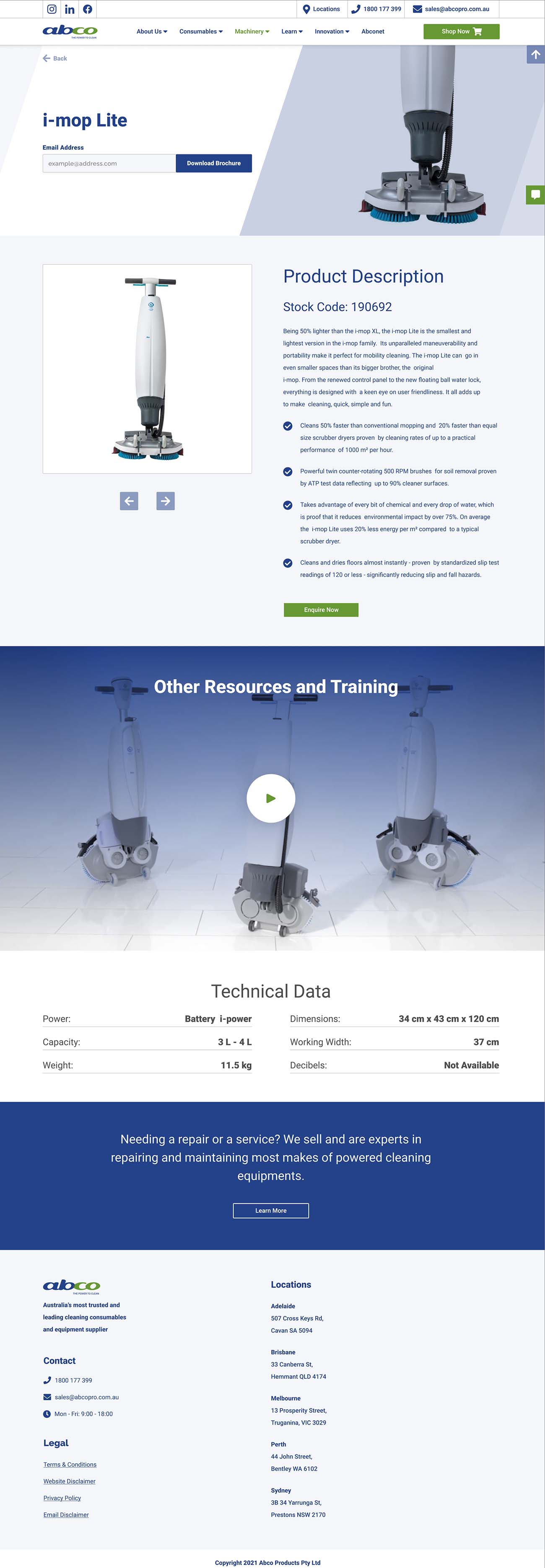
- Each individual product card displays a picture and some technical data. Click on the card and now you see all the information available. You can also download a PDF page from the digital catalogue, see the stock code, browse through the product photos, view a video and see the rest of the tech data available.
